Shop Voice
What Your Website Has To Do In The First Five Seconds
September 8, 2026 · Next Level Marketing Team
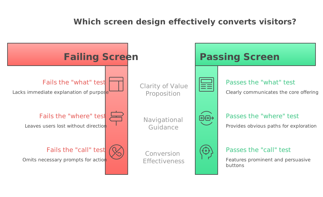
Somebody just landed on your homepage from their phone, standing in a parking lot next to a car that will not start. Your website has about as long as it takes them to decide whether to scroll or hit the back button, and in that window it has to answer three things: what you do, whether you do it near them, and how to reach you right now. Most local business websites fail at least one of those three. Usually it is a slideshow of stock photos, a slogan nobody asked for, and a phone number tucked in a footer three screens down.
Key takeaways
- The top of your page has one job: pass the visitor's fast sort of what, where, and how to reach you.
- A phone number that is not a tappable link is a phone number that does not get called.
- Sliders and stock photos move the message before it lands and slow the page down at the same time.
- AI receptionists only help with calls that actually get placed; the website is upstream of the phone system.
- You can audit this in an hour with your own phone: open the homepage, do not scroll, and see if you pass.
What is the visitor actually asking in those first seconds?
They are not asking about your mission or how long you have been family owned. That comes later, if at all. In the first moment they are running a fast sorting process: is this the right kind of business, is it close enough, and can I get a human.
Think about the last time you searched for something urgent yourself. You did not read. You scanned for a name, a location, and a button. Your customers are doing exactly the same thing to you.
So the top of your page has one job: pass the sort. Everything else on the site can be as long and as thoughtful as you want, because the people who scroll past the fold have already decided you might be the answer.
Why does the phone number matter more than the design?
There is a running theme in local marketing commentary right now, including a recent LinkedIn guide from Phil Frost aimed at small business owners: for most local service businesses, the phone is still where the lead actually arrives. Forms are fine. Chat widgets are fine. But the person with a leaking water heater is going to call.
That has a direct design consequence. On mobile, the phone number should be visible without scrolling and it should be tappable, meaning it is a real link that opens the dialer, not an image or plain text someone has to copy by hand. That sounds small. It is not. A number that cannot be tapped is a number that does not get called.
The same goes for hours. If you are closed, say so and say when you open. A visitor who calls a closed shop and gets nothing often does not call back.
What should be at the top of the page, literally?
Keep it boring and specific. A useful top-of-page block for a local service business looks roughly like this:
What you are. "Independent auto repair in Fort Wayne." Not "Excellence in automotive care." Where you are. The city or the neighborhoods you serve, in words, on the page. How to reach you. A tappable phone number and, if you take them, a booking link. One proof element. Your review rating, your years in business, or the brands you are certified on. One. Not a wall of badges.
If somebody screenshotted just that block and texted it to a friend, the friend should understand your business. That is the test.
Why do stock photos and sliders hurt more than they help?
Two reasons, one about people and one about speed.
The people reason: a rotating hero slider moves the message before the visitor has finished reading it, and stock photography of a smiling person in a headset tells them nothing about your shop. A real photo of your bays, your front desk, or your team is more persuasive than any stock image, even if the lighting is worse. It signals that a real place exists.
The speed reason: heavy image carousels are one of the most common causes of a slow-loading homepage on small business sites. On a phone, on a weak signal, in a parking lot, a slow page is a page nobody sees. Trimming the hero is often the single cheapest speed fix available.
How does this connect to AI answering and the tools everyone is pitching?
There is a lot of noise right now about AI receptionists and AI answering services. Salesforce published a guide to the category this year, and the pitch showing up in small business groups is almost always framed the same way: lost customers from missed calls.
The framing is not wrong. But note what it assumes. It assumes the call happens. An AI receptionist does nothing for a visitor who never found your number, never saw that you serve their town, and bounced in four seconds. The website is upstream of the phone system.
If you are weighing one of those tools, that is a reasonable thing to consider on its own merits. Just do not buy call-handling software to fix a problem that lives on your homepage. Fix the top of the page first, then decide whether you have a call volume problem worth automating.
What can you fix this week without a rebuild?
You do not need a new site. You need about an hour and your own phone.
Open your homepage on your phone, not your desktop. Do not scroll. Ask: can I tell what this business does, can I tell where it is, and can I tap to call. If any answer is no, that is the whole to-do list.
Then have somebody who does not work for you do the same thing. Give them nothing but the URL. Watch where their thumb goes. That five seconds of watching will tell you more than any analytics dashboard.
Frequently asked questions
What should be above the fold on a local service business website?
Above the fold you need four things: what your business does, the city or area you serve, a tappable phone number, and one piece of proof such as a review rating or years in business. Everything else can wait until the visitor scrolls. The goal is to let someone confirm in a glance that you are the right kind of business in the right place.
Does my phone number really need to be at the top of the page?
Yes, and it needs to be a real clickable link so a phone opens the dialer when someone taps it. For most local service businesses the phone is still the main way a lead actually arrives, so making the number hard to find works directly against the point of the site. Put it in the header, keep it visible on mobile, and repeat it at the bottom.
Is a homepage slider or image carousel bad for a small business site?
Sliders tend to hurt on two fronts. They move your message before the visitor finishes reading it, and large rotating images are a common cause of slow mobile load times. A single real photo of your shop or team with clear text over it usually performs better and loads faster.
Should I buy an AI receptionist for my shop?
It depends on whether missed calls are genuinely your bottleneck, and that is worth measuring before you spend. An AI answering service only helps with calls that actually get placed, so if visitors are leaving your homepage before they ever find the number, the tool will not fix the underlying problem. Sort out the website first, then evaluate call handling with real numbers from your own business.
How do I know if my website is failing in the first five seconds?
Open it on a phone, do not scroll, and see whether you can name the business type, the service area, and a way to call. Then hand the URL to someone unfamiliar with your business and watch what they do without coaching them. If they hesitate or start scrolling to figure out what you do, the top of your page is not doing its job.
Do I need a full website redesign to fix this?
Usually not. Most of these problems are content and layout at the very top of the homepage, which is often a matter of editing text, adding a tappable phone link, and swapping a stock image for a real one. Start there, and only consider a rebuild if the site is also slow, hard to edit, or broken on mobile.